


It’s that time of year again—the Colors of the Year for 2026 are starting to roll out.
From a cool, calm, and collected shade of green to a rich, cozy red that feels instantly inviting, this year’s palette strikes the perfect balance between fresh and timeless. It’s safe to say, the rollout so far did not disappoint us.
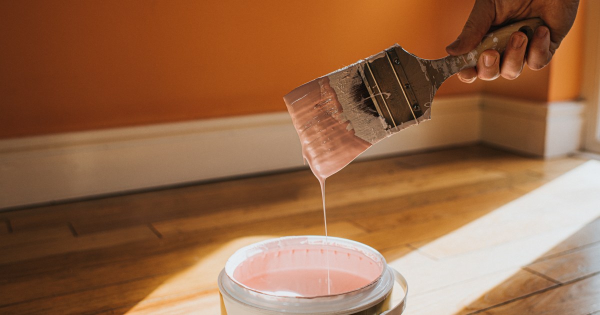
Painting a space in your home is one of the simplest ways to give it a fresh new look without costly renovations. With the 2026 Colors of the Year now coming in, there’s no better time to grab your paintbrush and get inspired by the shades that designers and color experts are raving about.
Hidden Gem by Behr
“Hidden Gem” is a refreshing, nature-inspired shade that instantly breathes new life into any space. Whether you use it in a bathroom, living room, or even a home office, this stunning hue has the power to brighten up dull spaces and instantly transform dark corners into warm and inviting areas.
Warm Eucalyptus by Valspar
“Warm Eucalyptus” is a shade that is equally comforting as it is ethereal. According to Sue Kim, the Director of Color Marketing for Valspar, “going beyond the classified color term, neutral refers to colors that set a grounding and inviting mood with the warmth that calms our senses.” This gorgeous shade would be a dream for any bathroom or guest bedroom that needs some sprucing up.
People Had Lots to Say About Bobby Flay’s Renovated NYC Apartment
Warm Mahogany by Glidden
“Warm Mahogany” is a rich, burnt-red shade that looks luxuriously cozy. This brick-like hue would work as an accent wall in your dining room or living room area, but also would look wonderful as an all over color. If you’re ready to move beyond pale, neutral shades, this deliciously bold tone is a must-try.
Special Walnut by Minwax
You can never go wrong with a dark and romantic wood stain! In a press release earlier this week, Lisbeth Parada, the color and design lead at Minwax spoke about what makes “Special Walnut” so special. She said, “Special Walnut delivers with a classic, dimensional tone that feels both familiar and fresh. Its versatility makes it a favorite across styles and applications—whether you’re restoring a vintage piece or finishing a weekend project.”
Coastal Vibes! Christina Hall’s Best Home Remodels: Before, After Photos
Melodious Ivory by Dutchboy
Another announced so far is a timeless, creamy color that will never go out of style. Don’t be fooled—“Melodious Ivory” may be neutral, but it’s anything but dull. This versatile hue can instantly brighten any space, whether you’re freshening up a bathroom or giving your kitchen cupboards a clean, crisp new look.
Universal Khaki by Sherwin-Williams and HGTV
Who says neutrals can’t be in? Sue Wadden, director of color marketing at Sherwin-Williams shared what makes this color special. “Khaki is more than just a neutral—it’s a timeless, go-anywhere shade that brings a sense of grounded elegance to any space.”
“With its warm, earthy undertones, Universal Khaki SW 6150 effortlessly complements a wide range of colors, creating a rich, inviting backdrop that can transform an entire design with quiet confidence.”
Divine Damson by Graham & Brown
According to Graham & Brown, “Divine Damson” is is a “timeless and versatile color that suits a variety of styles and environments. The dark damson color evokes a sense of elegance, luxury and sophistication.” This warm and vibrant shade would bring depth to your living room or as an accent color to add a romantic spin in your bedroom.
C2 Epernay by C2 Paint
The final shade that we have seen so far is a pretty pale yellow. According to C2 Paint this color’s “classic hue recalls life’s essential luxuries: the tactile surface of a handmade bowl, the hand-carved lines of ornamental millwork, and the grounding presence of nature—those often-overlooked details that give a home its soul.”
Be sure to check back in for more 2026 colors of the year. We are just getting started.